Cape Town
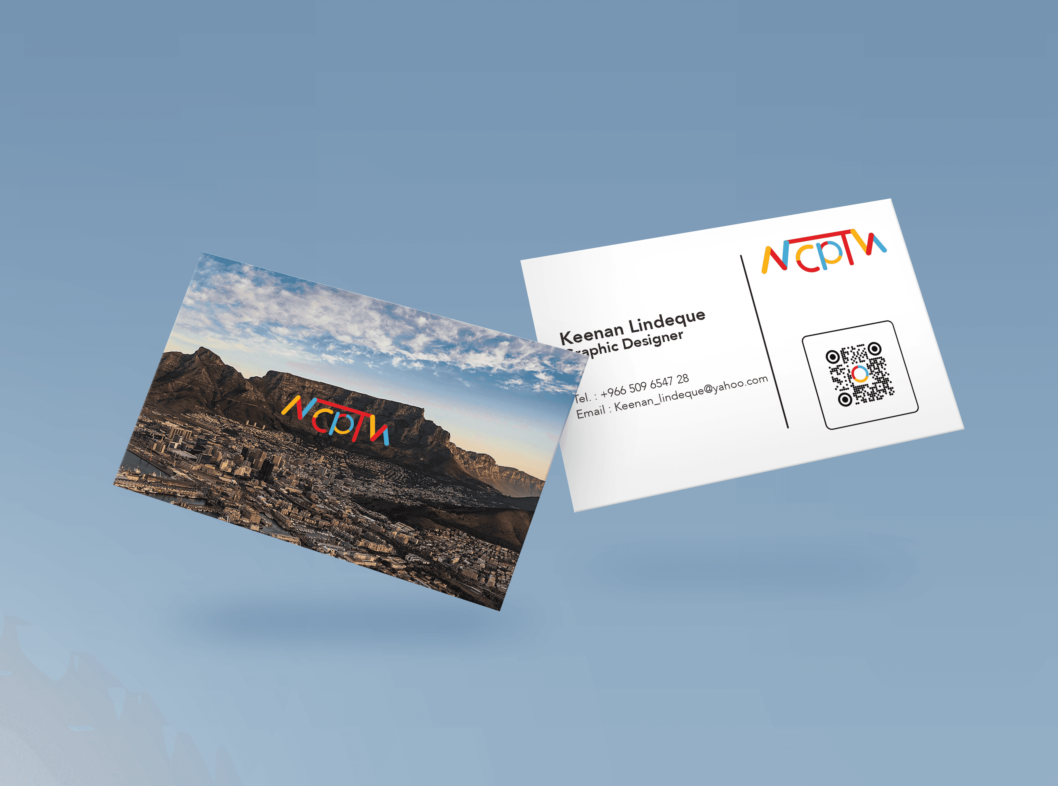
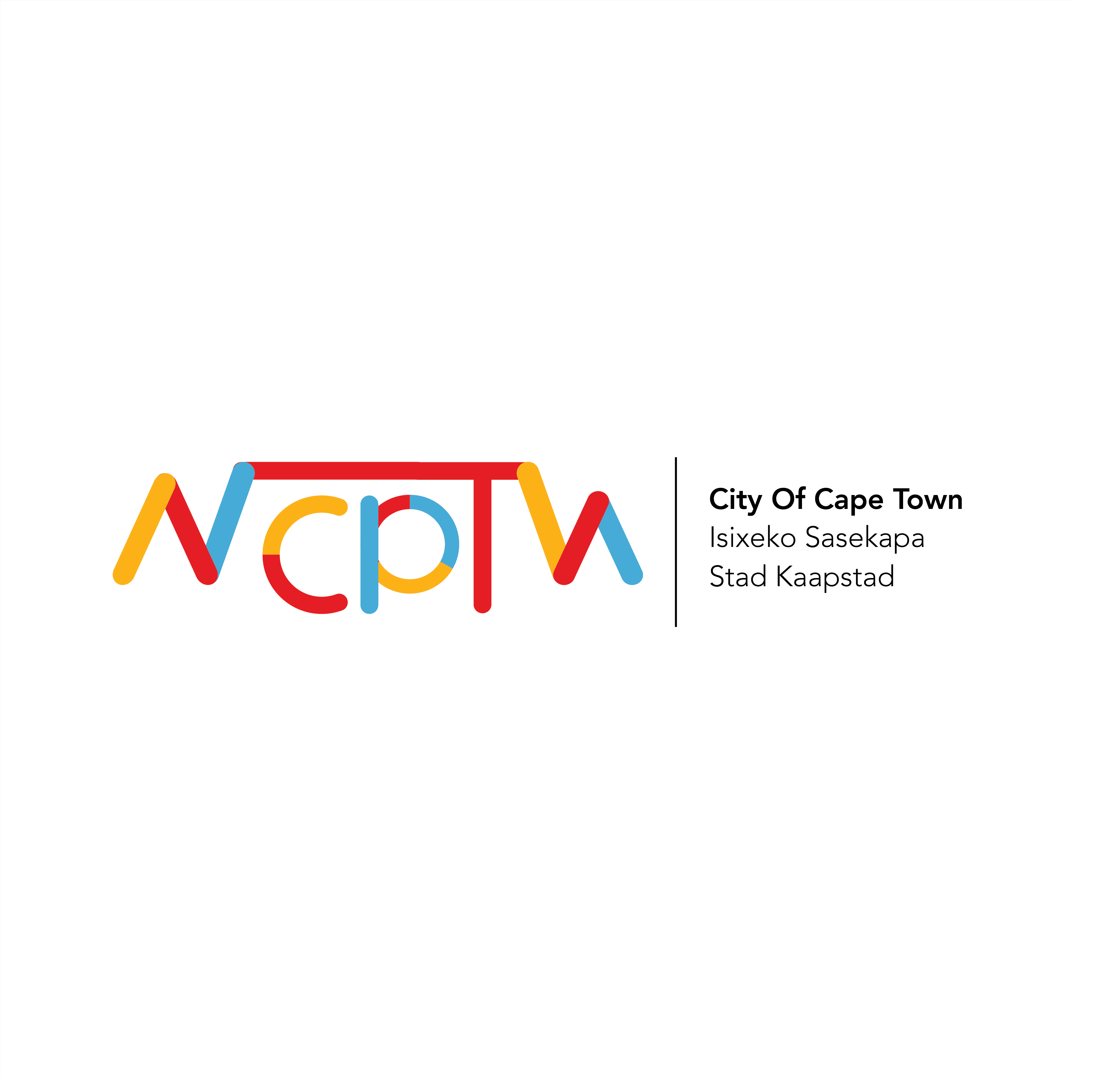
As part of a university brief to rebrand our home cities, I chose Cape Town. The logo takes inspiration from the three colors of the South African flag, symbolising unity, diversity, and hope. The circular shape represents inclusivity and community, while the central form reflects the distinctive outline of Table Mountain—an iconic symbol of the city’s identity and pride. The result is a modern, meaningful brand that captures Cape Town’s cultural richness and visual landscape.
Client
University Work
DELIVERABLES
Brand Identity
Year
2023
Role
Graphic Designer